Umba Lending
Umba's loans in Nigeria started as an MVP. Over a year of small releases, I designed the version people could apply for, repay and recover with.
- Role
- Lead Product Designer (UX Research, UX/UI, Design QA)
- Team
- 1 product manager, 4 engineers, 4 data scientists, 1 designer (me)
- Duration
- Jun 2021 – Jun 2022
- Platform
- Android app, Nigeria
- Outcome
- Fewer people dropped off during the loan application, and the number of loans grew over the year.
Overview
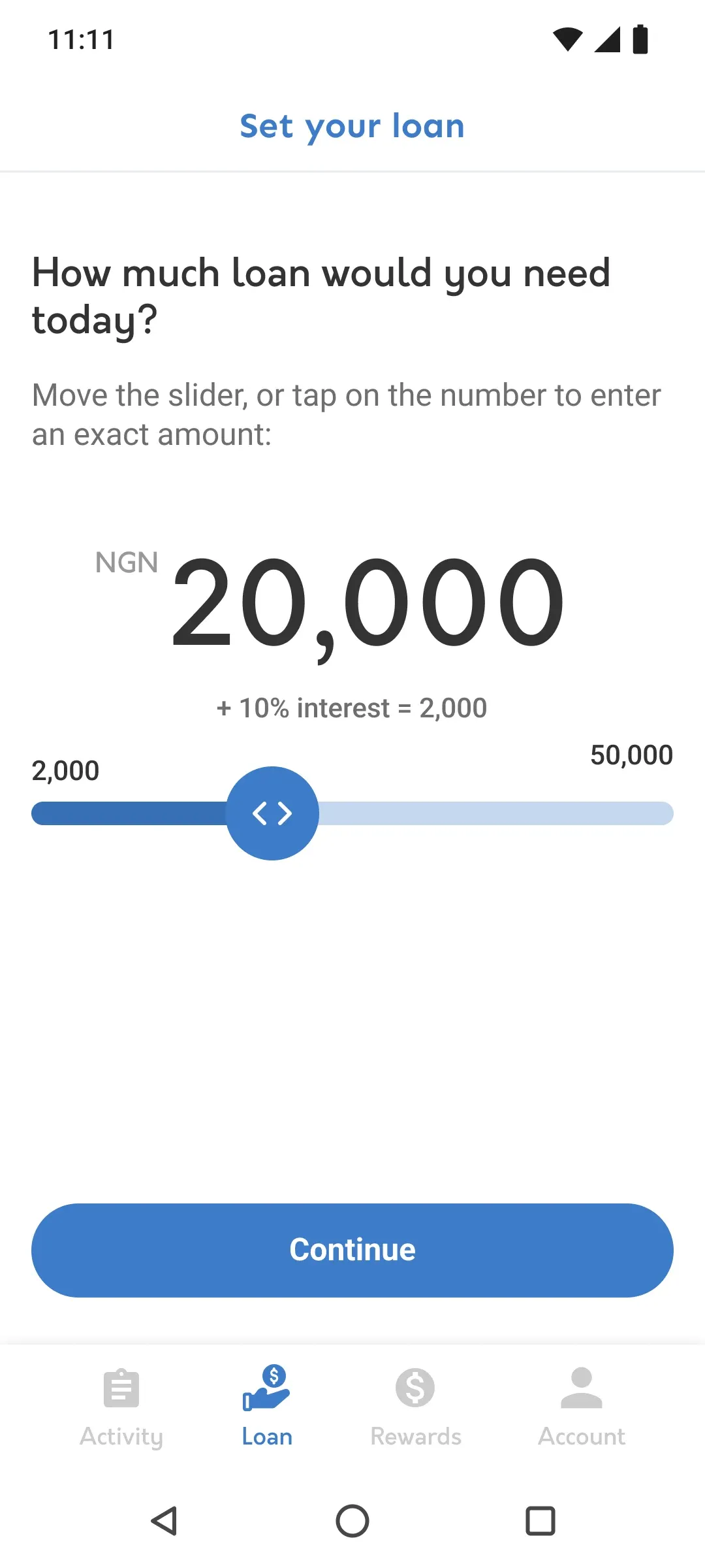
Umba was a US fintech building a mobile bank for people in Nigeria and Kenya. In Nigeria it offered small loans: borrow a set amount, pay it back in four weekly payments.
When I joined in June 2021, lending was an MVP. I was the lead designer for it, working with a product manager, four engineers and four data scientists. Over the next year we turned it into a complete product: apply, connect a bank account, get an offer, repay, recover from a missed payment and borrow again.
None of it shipped as one big redesign. Every piece went to production in small releases, which meant each flow had to work on its own while the rest of the app was still changing around it.
Research without direct access to users
We tried video interviews with borrowers in Nigeria. Unstable connections, accents and dialects made them hard to run and harder to learn from, so I built the research around three other sources:
- Internal usability tests in Maze, to catch problems in a flow before it went anywhere near a release.
- The customer experience team in Nigeria. They talked to borrowers every day and knew the context. I sent them prototypes, and they came back with what people would and wouldn’t understand.
- The business’s own analytics, to see where people dropped out of the application.
1. A repayment schedule people can read at a glance
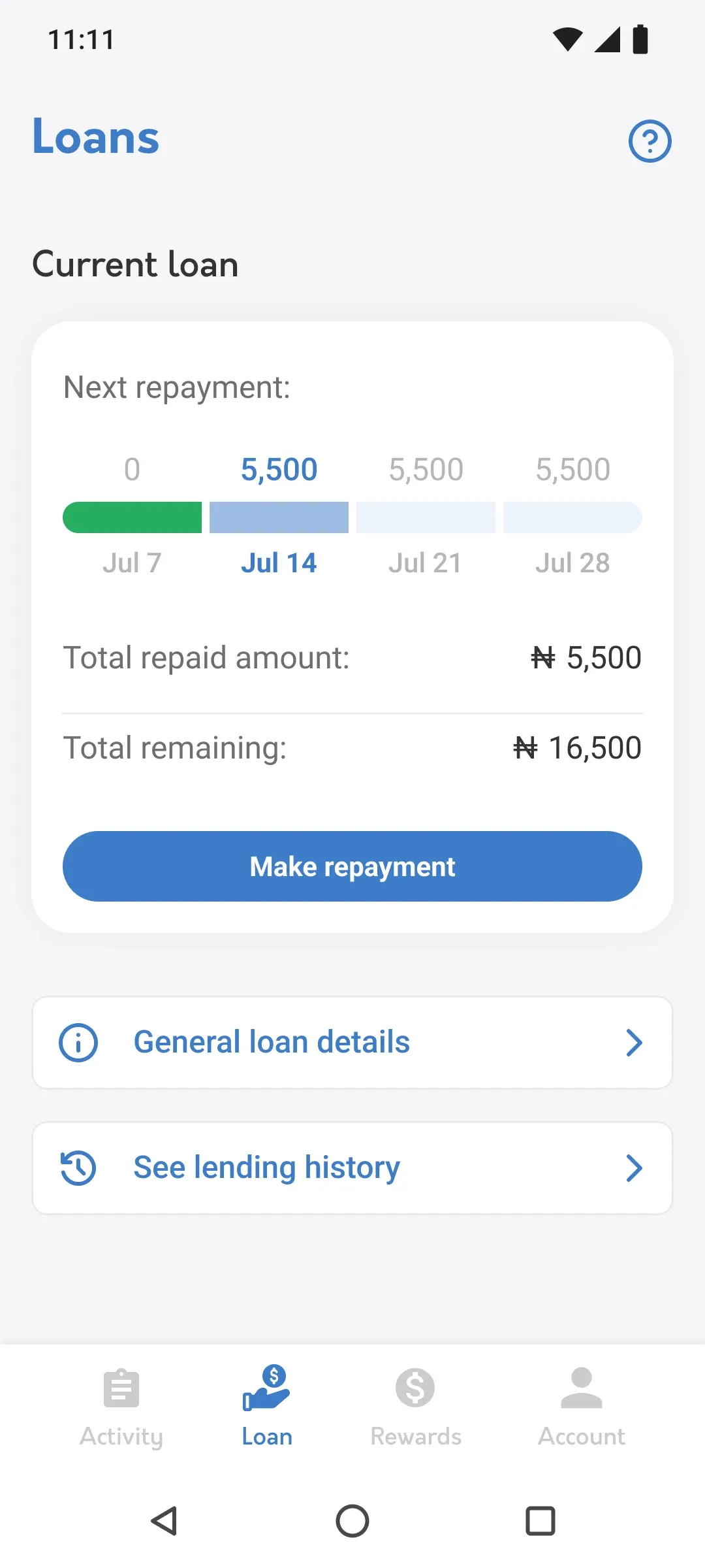
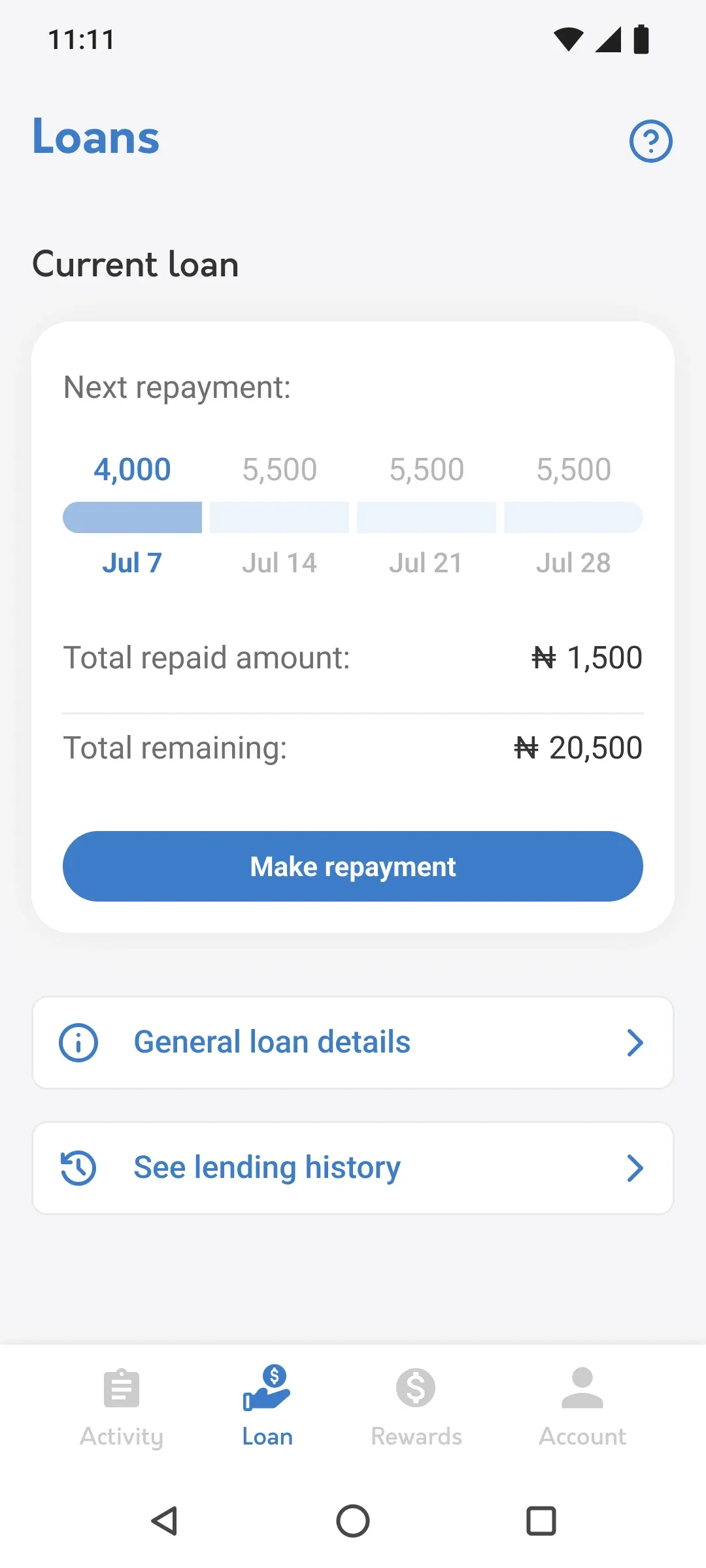
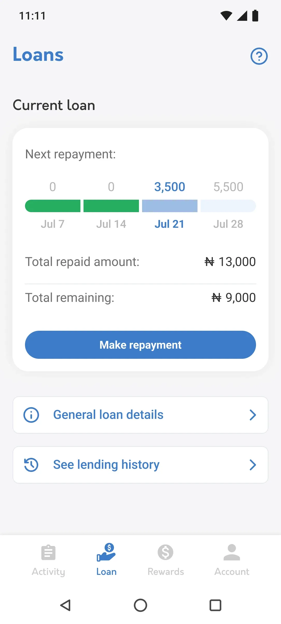
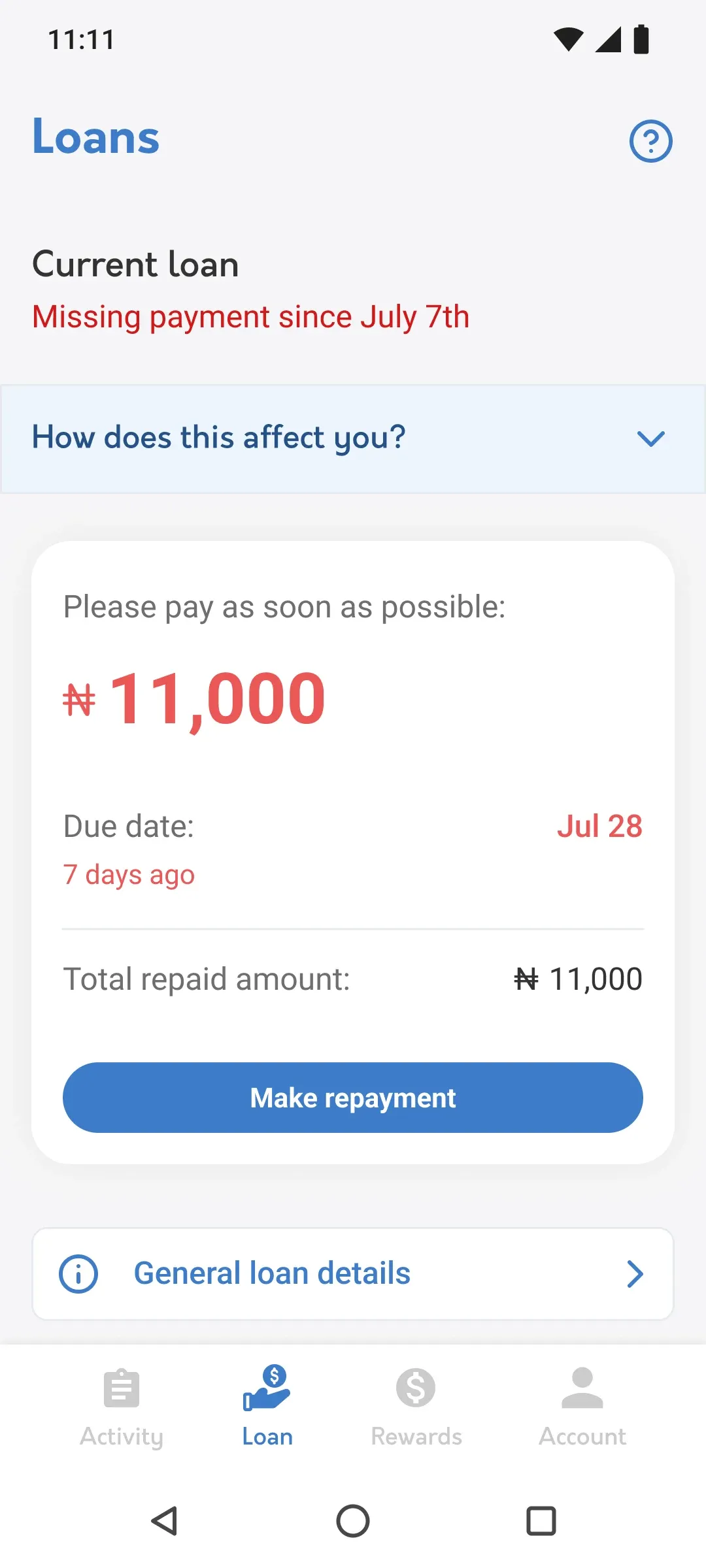
My first version of the active loan showed four weekly charges, W1 to W4. It worked for someone who paid exactly on time. It confused everyone else: a borrower who paid part of a week couldn’t tell whether they were late, what they still owed or what would happen next.
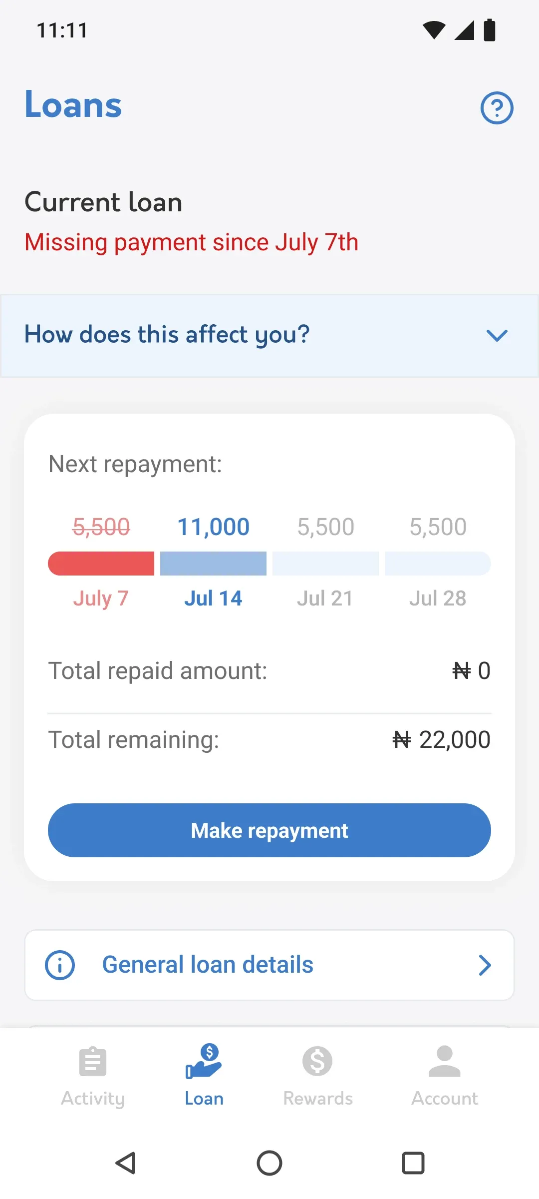
I redesigned it as a segmented timeline, one segment per payment, with five clear states: up to date, missed payment, partial payment, overpayment and defaulted. Each state says what happened and what’s due now, and a “How does this affect you?” section explains the consequences in plain words, on the screen where the borrower is already looking.
Up to date
Missed payment
Partial payment
Overpayment
Defaulted
2. Designing for failure
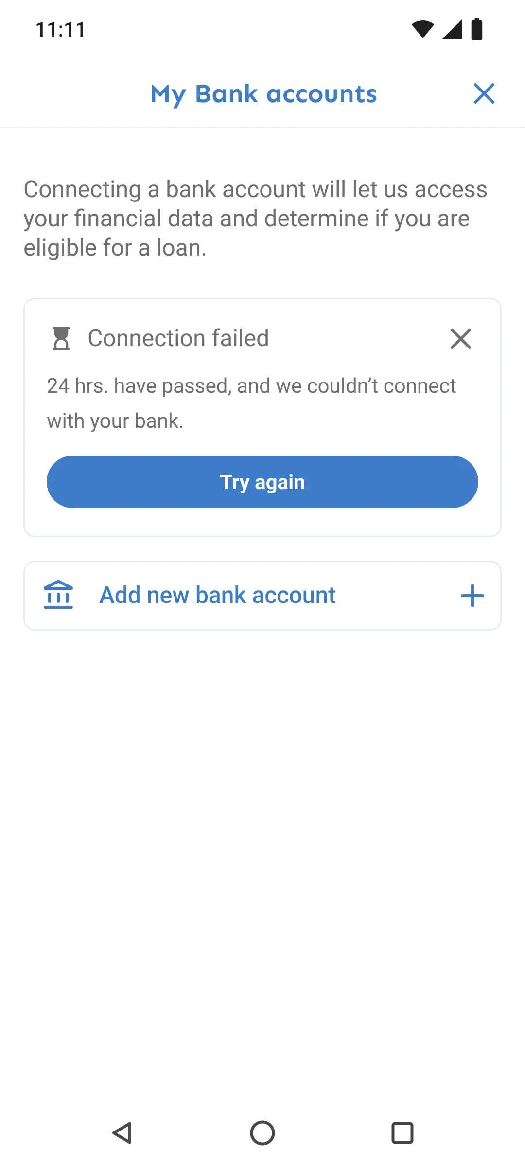
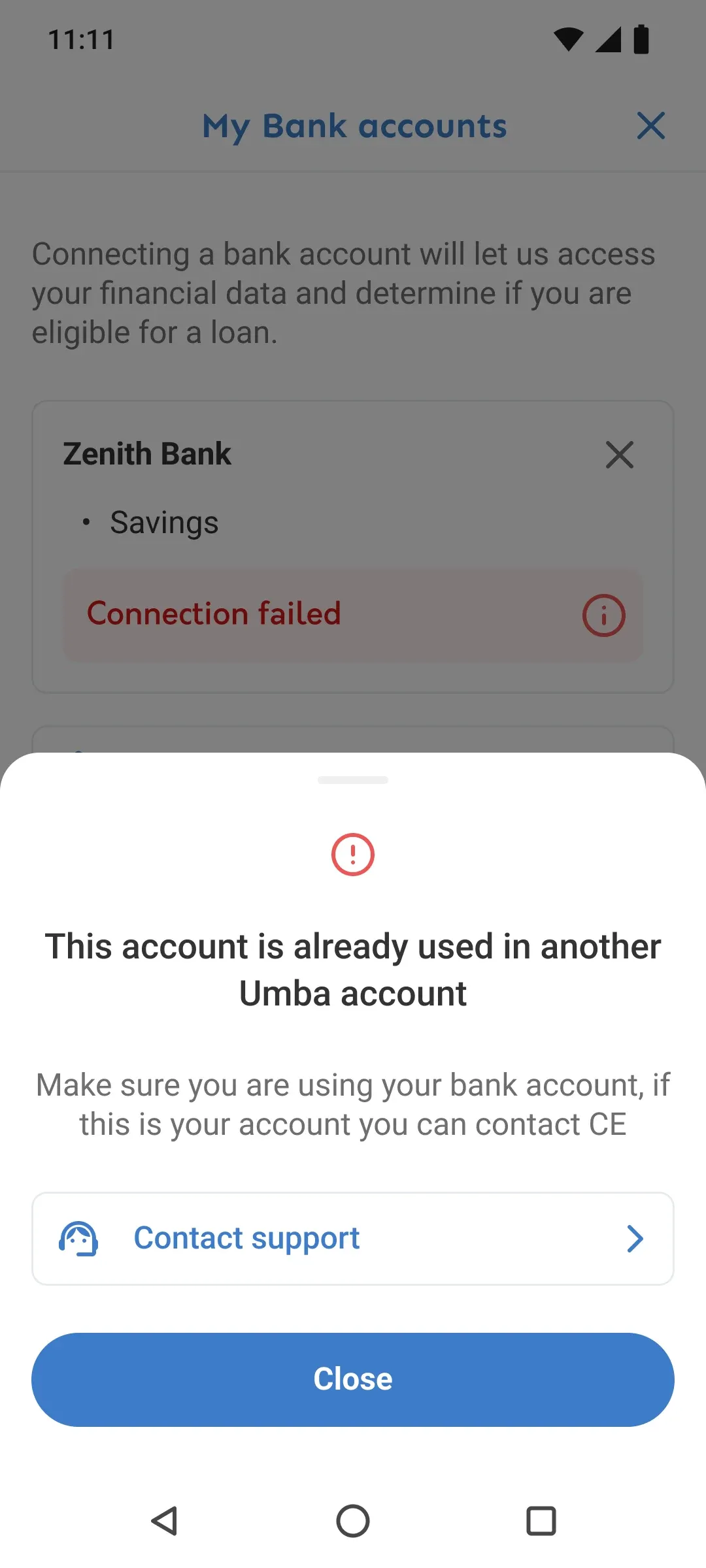
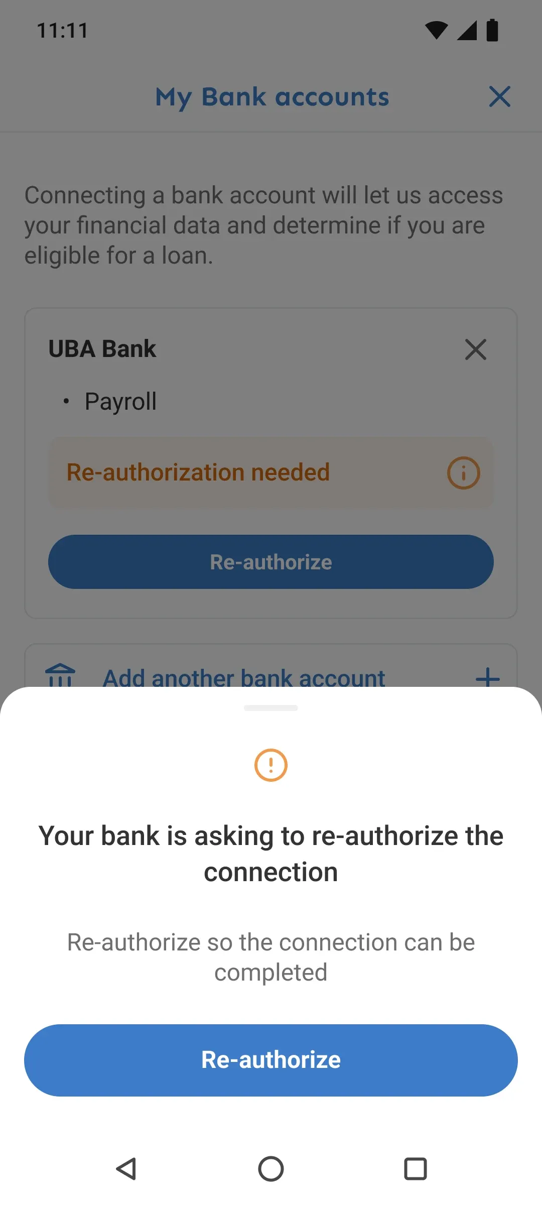
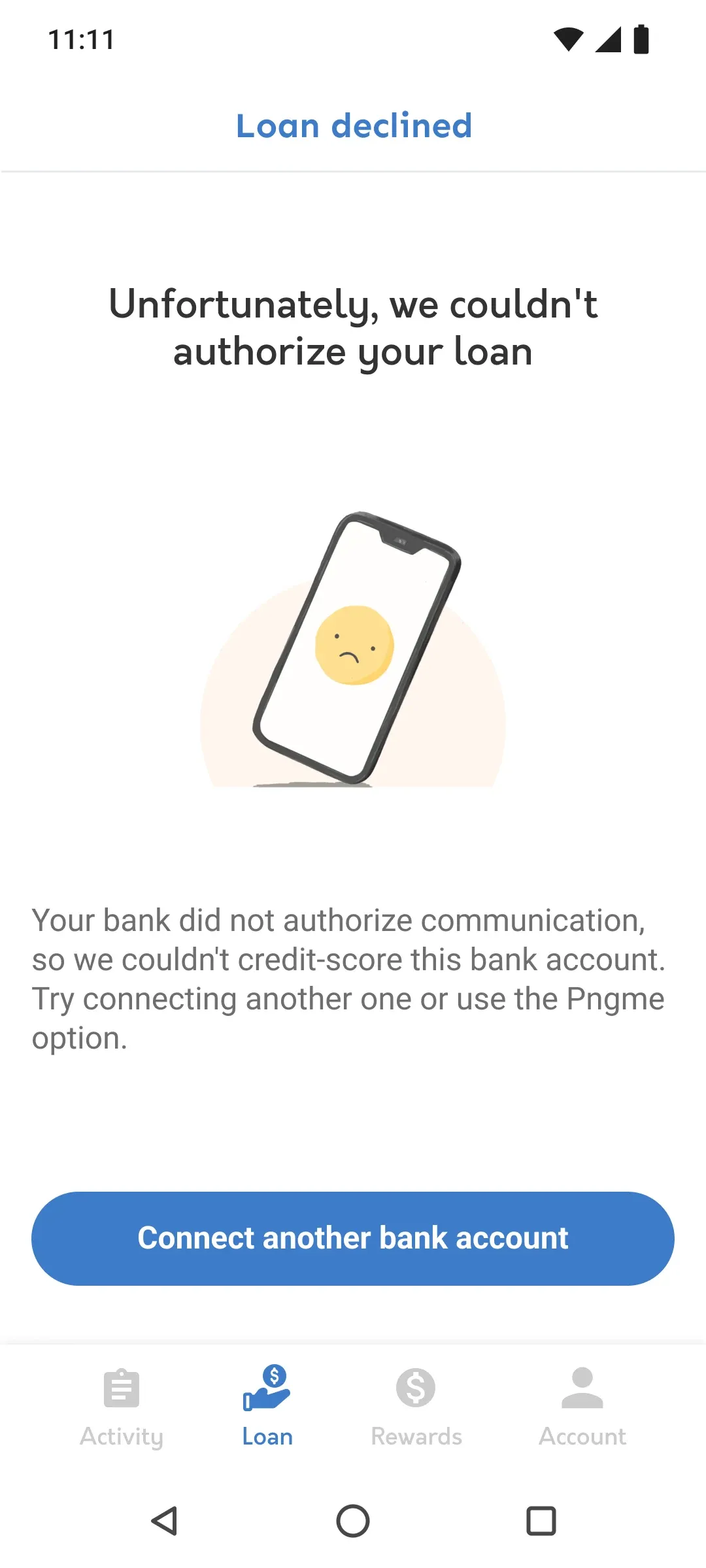
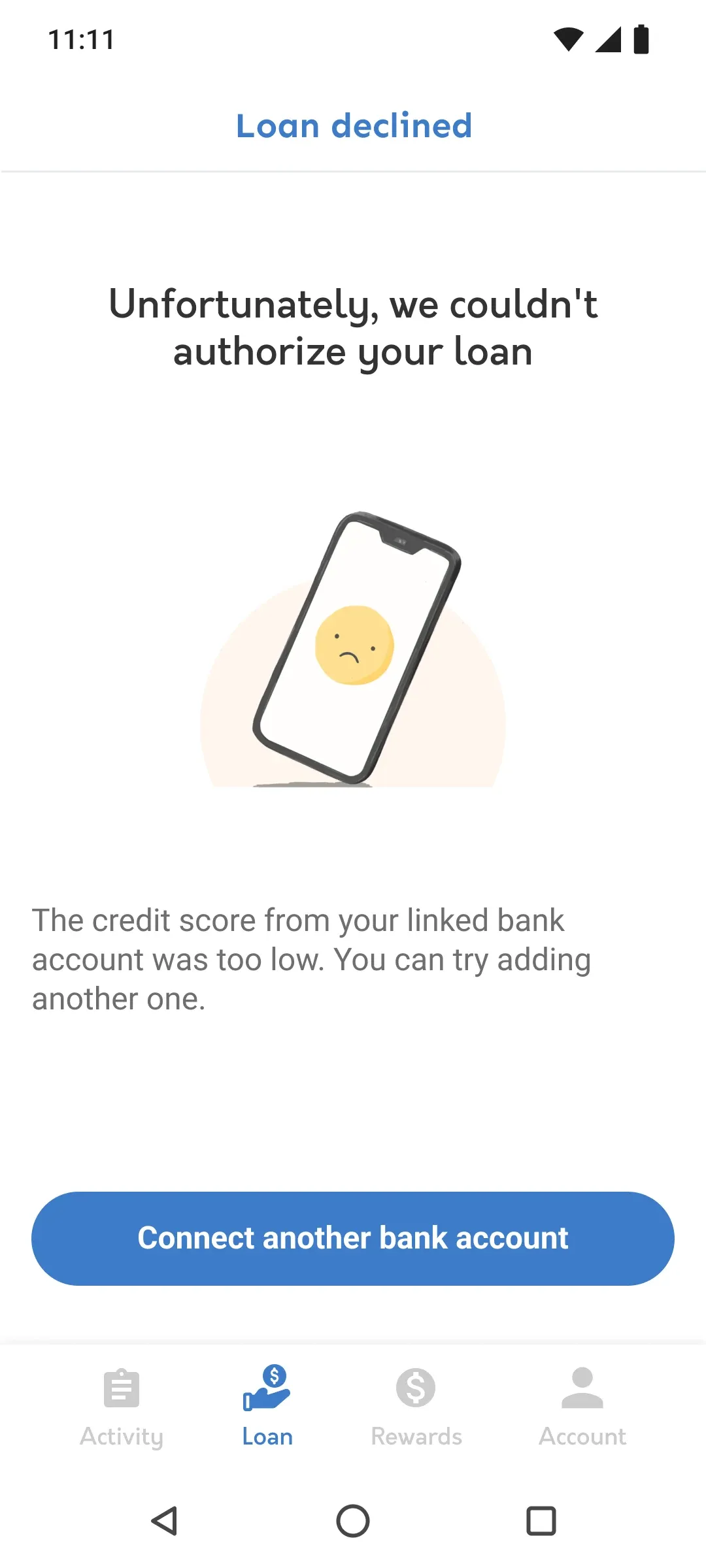
The application is where people dropped off, and much of it depended on connecting a bank account through Mono. A lot could go wrong there, outside our app: a connection that took up to 24 hours, duplicate accounts, an authorization that expired. And some people would be declined.
I treated each of those as part of the flow, not an error message. Every failure screen says what happened in plain language and gives one next step: wait and we’ll let you know, choose the right account, reconnect, or, for a declined borrower, what they can do next. A dead end in the application is a borrower who doesn’t come back.
3. Funding your wallet isn’t repaying your loan
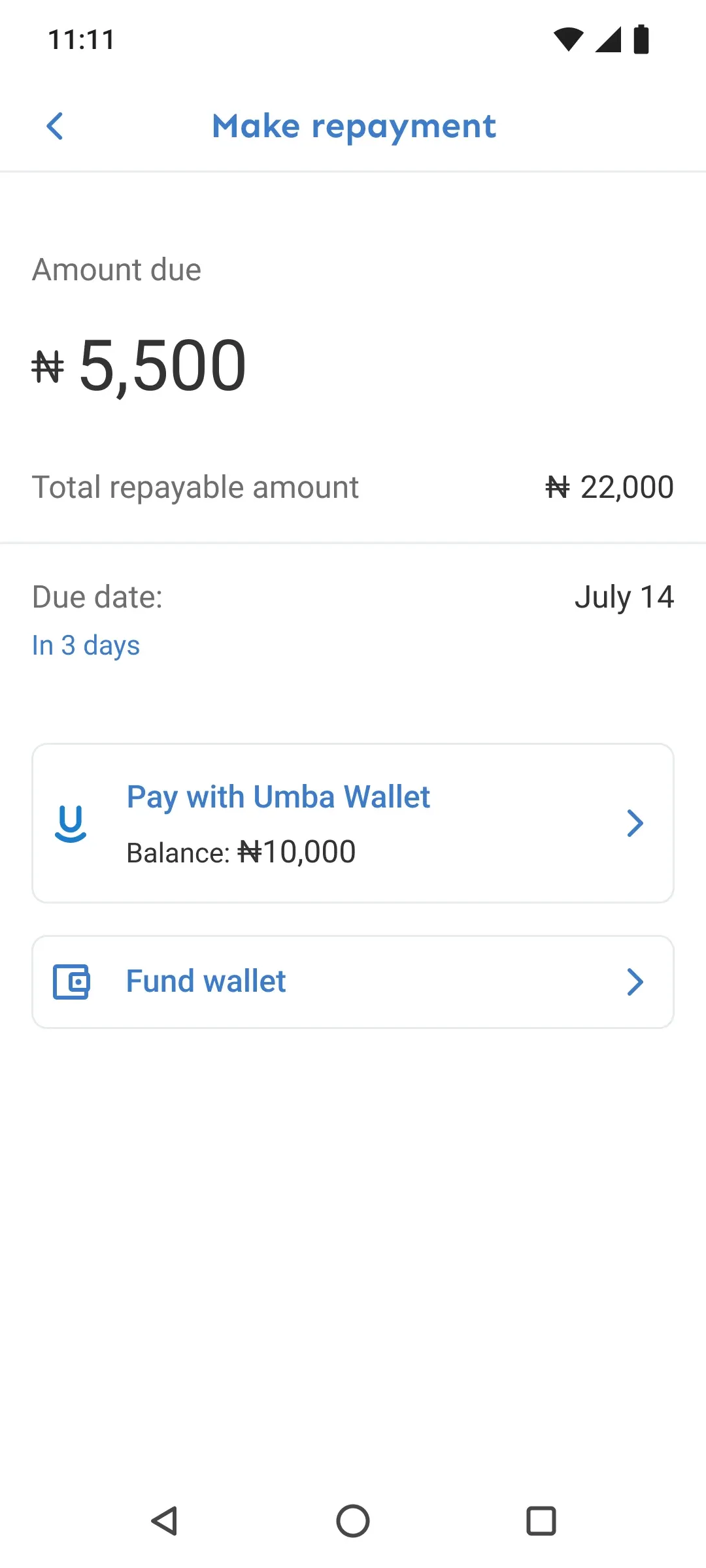
Some borrowers added money to their Umba wallet and assumed that paid their loan. It didn’t, and they ended up late with the money sitting in the app.
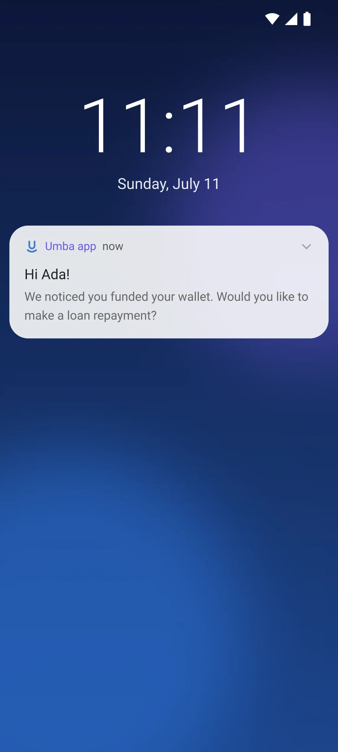
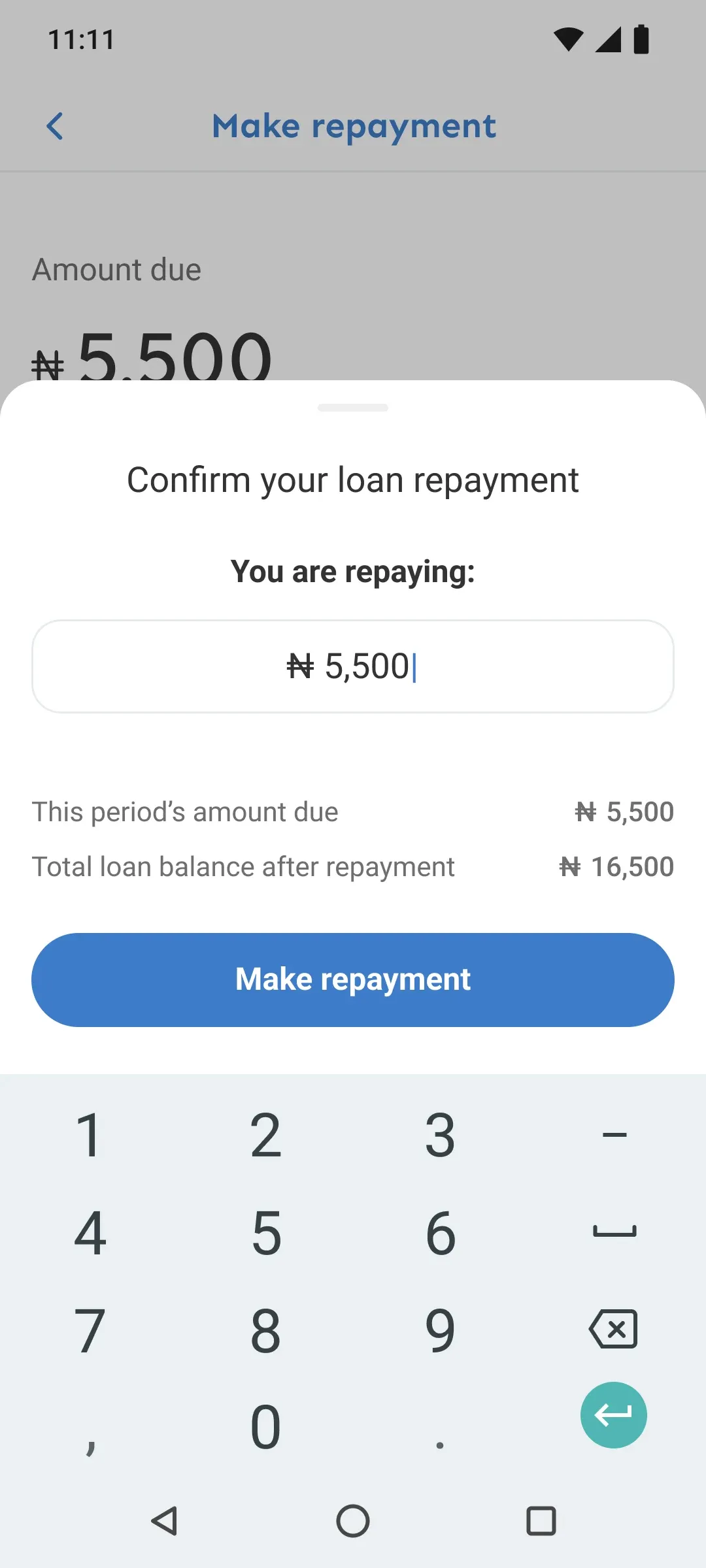
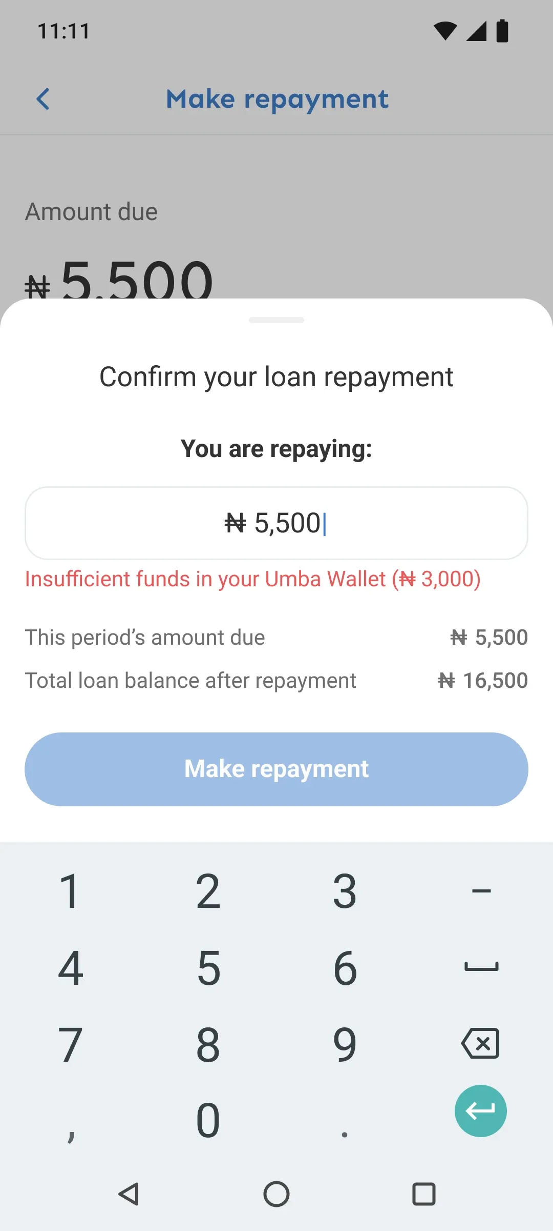
Instead of explaining the difference one more time, we met them where they already were. When someone funds their wallet while a payment is due, a push notification says so, and a deep link takes them straight to the repayment. If the wallet doesn’t have enough, the confirmation says so before they pay.
Reflections
- Design QA is part of the design. Before releases I reviewed the live Android build against the files, side by side: how it looks, how it should look. In an app that handles people’s money, small gaps in spacing and states make it feel less trustworthy.
- Shipping small means choosing what waits. Direct debit and lending in Kenya both moved to later releases so the core loan could keep shipping.
- When you can’t reach users, work with the people who do. The customer experience team was my closest connection to borrowers, and the research was better for treating them as partners rather than as a support queue.
Over that year, fewer people dropped off during the loan application and the number of loans grew.
Screens come from the 2021–2022 design files. Names and numbers have been changed.